Avatar
It's more than just an image with a border radius, I promise.

<script>
import { Avatar } from '$lib/components/avatar';
</script>
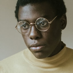
<Avatar class="size-6" src={user.avatarUrl} />
<Avatar class="size-8" src={user.avatarUrl} />
<Avatar class="size-10" src={user.avatarUrl} />Component API
| Prop | Default | Description |
|---|---|---|
Avatar extends the JSX <span> element | ||
src | - | The URL of the avatar image. |
square | false | Whether to make the avatar square. |
initials | - | The initials to use when no src is provided. |
AvatarButton extends the Headless UI Button component or the Link component | ||
src | - | The URL of the avatar image. |
square | false | Whether to make the avatar square. |
initials | - | The initials to use when no src is provided. |
href | - | The target URL when using the button as a link. |
Examples
Basic example
Use the Avatar component along with a size-* utility to render an avatar image:
<script>
	import { Avatar } from '$lib/components/avatar';
</script>

<Avatar class="size-6" src={user.avatarUrl} />
<Avatar class="size-8" src={user.avatarUrl} />
<Avatar class="size-10" src={user.avatarUrl} />
With initials
Use the initials prop to render an avatar with initials:
<script>
	import { Avatar } from '$lib/components/avatar';
</script>

<Avatar initials="tw" class="size-6 bg-zinc-900 text-white dark:bg-white dark:text-black" />
<Avatar initials="tw" class="size-8 bg-zinc-900 text-white dark:bg-white dark:text-black" />
<Avatar initials="tw" class="size-10 bg-zinc-900 text-white dark:bg-white dark:text-black" />
Be sure to include bg-{color} and text-{color} utilities for both light mode and dark mode.
With initials as fallback
Include both the src and initials props to show the initials as a fallback while the avatar image loads:
<script>
	import { Avatar } from '$lib/components/avatar';
</script>

<Avatar src={user.avatarUrl} initials={user.initials} class="size-6 bg-purple-500 text-white" />
<Avatar src={user.avatarUrl} initials={user.initials} class="size-8 bg-purple-500 text-white" />
<Avatar src={user.avatarUrl} initials={user.initials} class="size-10 bg-purple-500 text-white" />
Square avatars
Use the square prop to render a square avatar:
<script>
	import { Avatar } from '$lib/components/avatar';
</script>

<Avatar square class="size-8" src={user.avatarUrl} />
<Avatar
	square
	initials={user.initials}
	class="size-8 bg-zinc-900 text-white dark:bg-white dark:text-black"
/>
Avatar groups
Use utility classes to overlap a list of avatars and style them as a group:


<script>
	import { Avatar } from '$lib/components/avatar';
</script>

<div class="flex items-center justify-center -space-x-2">
	{#each users as user}
		<Avatar src={user.avatarUrl} class="size-8 ring-2 ring-white dark:ring-zinc-900" />
	{/each}
</div>
Use the ring-{color} and dark:ring-{color} utilities to match the notched area with your background color.
Using as buttons
Use the AvatarButton component to render an avatar as a button:
<script>
	import { AvatarButton } from '$lib/components/avatar';
</script>

<AvatarButton class="size-8" src={user.avatarUrl} />
<AvatarButton square class="size-8" src={user.avatarUrl} />
Using as links
Use the AvatarButton component with the href prop to render an avatar as a link:
<script>
	import { AvatarButton } from '$lib/components/avatar';
</script>

<AvatarButton href={user.url} class="size-8" src={user.avatarUrl} />
<AvatarButton square href={user.url} class="size-8" src={user.avatarUrl} />